Mindspeak
Complex Product Solution
OVERVIEW
Project Brief
MindSpeak is a company providing Neurofeedback training. Neurofeedback is a non-pharmaceutical therapy treatment with no known negative side effects. It can help with anxiety, stress, insomnia, depression, and ADHD. Neurofeedback training can also improve focus and concentration.
The Problem
Complex solution for the new brand – Branding, UX/UI Design, prototyping, graphic illustrations and icons for the website and Social Media, WordPress development.
The Goal
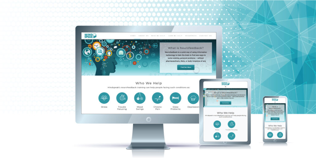
The objective was to promote a new brand – Mindspeak through building a website and Social Media. Steps:
- Branding (Logo redesign, color scheme, branding guide)
- UX/UI Design (research, personas, wireframes, prototype)
- Graphic Design (vector icons, illustrations)
- Web development (WordPress)
- Social Media templates
Team
I worked as a part of the cross-functional team. As the main UX/UI designer, I was involved in all phases of the project, from defining the problem to website development.
Responsibilities
Research, UX Design, Visual Design, Prototyping, Testing, Branding, Web Development

Define
Define the User
Understanding the user's goals and needs with User Research and creating Personas
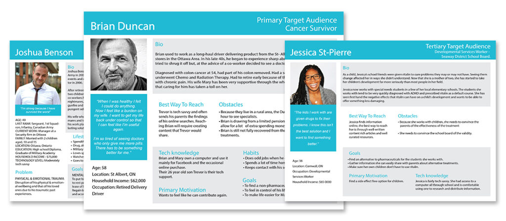
My fist work stage is defining the user audience and creating personas. What are personas and why we need them? Personas are archetypical users whose goals and characteristics represent the needs of a larger group of users. Usually, a persona is presented in a one-page document. The description includes behavior patterns, goals, skills, attitudes, and background information, as well as the environment in which a persona operates. Using the type and direction of personas’ thinking, you can compose the alleged scenarios of their actions and understand how they would use this product.
Design
Moodboards
A picture is worth a thousand words
A mood board is extremely useful for establishing the aesthetic feel of a web site. It usually fits into the process somewhere after wireframes and before design mockups. Things that can be explored in the mood board include photography style, color palettes, typography, patterns, and the overall look and feel of the site. Soft or hard? Grungy or clean? Dark or light? A rough collage of colors, textures and pictures is all it takes to evoke a specific style or feeling. The mood board is intentionally casual; it lets the designer start with broad strokes and get feedback before too much time is invested in the wrong direction. Think of it as rapid visual prototyping.
Branding
Design Consistency makes a brand the brand
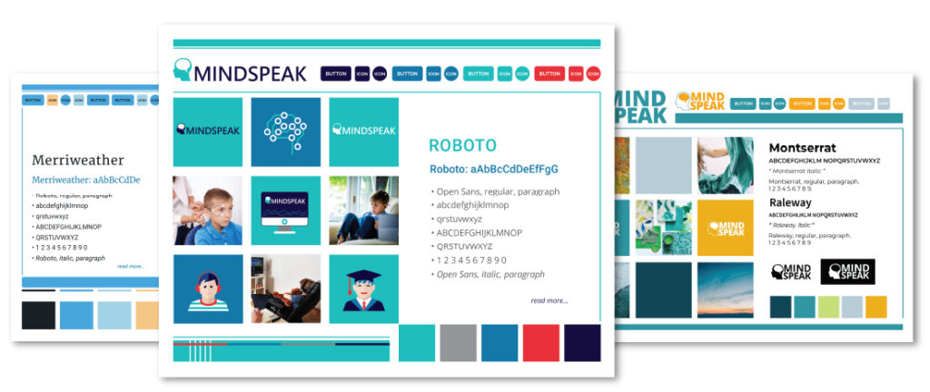
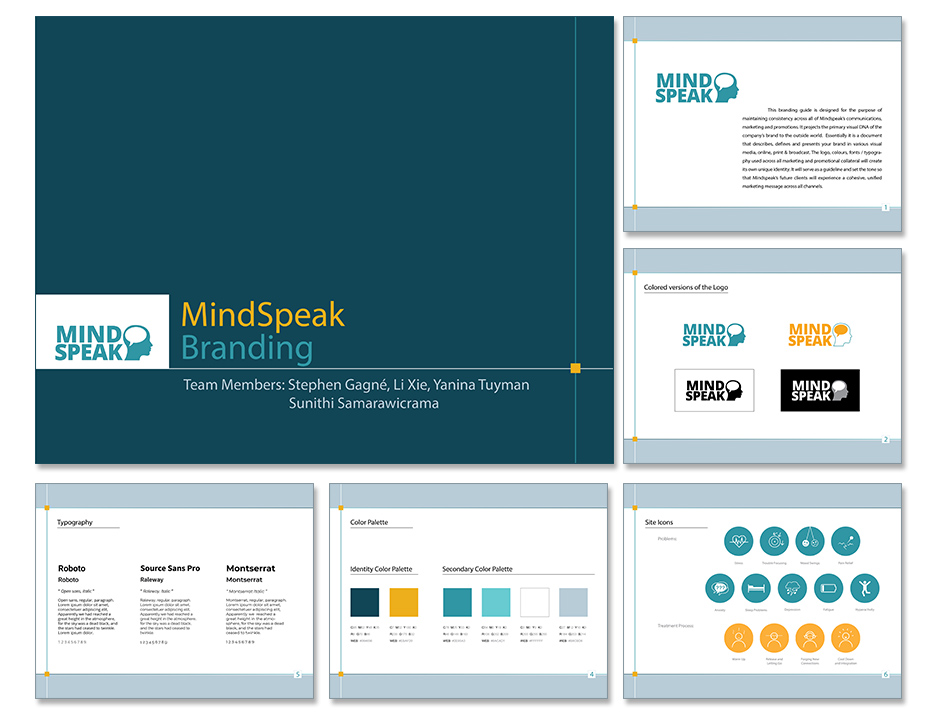
The next step was Branding. We designed a Logo, color scheme, found suited fonts, and finally, created a Branding Guide. The Branding Guide supposed to keep our work consistent.
Icons and Illustrations
To promote the new brand and make the site intuitive simple and user-friendly we created a set of icons explaining the equipment work process.
Develop
Potential Solutions
Low-Fidelity Wireframes
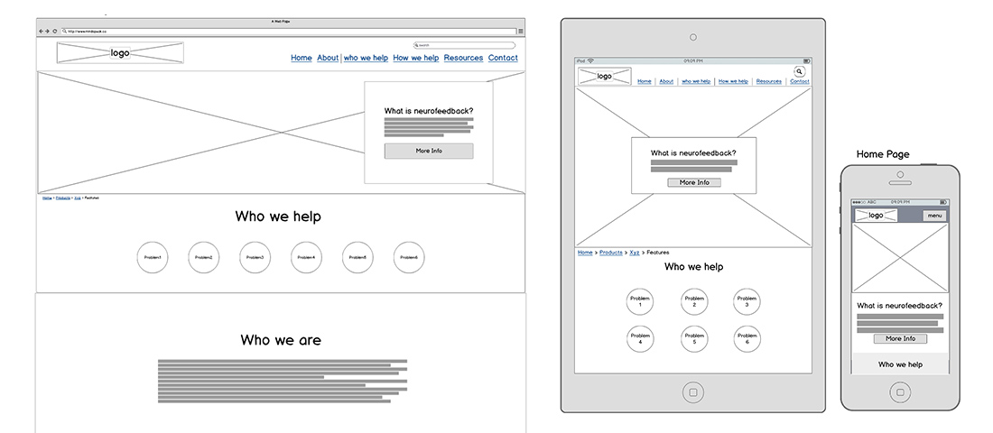
The research made it evident how different users would use the app. After summarizing the information from user interviews and data analysis, It was time to sketching different solutions to help business and users.
Prototyping
Prototyping is the key element in User Experience Design. It helps to test the product before spending too much time and money on the development stage. It helps to correct in time the design and flow of the product.
Deploy
Final Solutions
WordPress Development
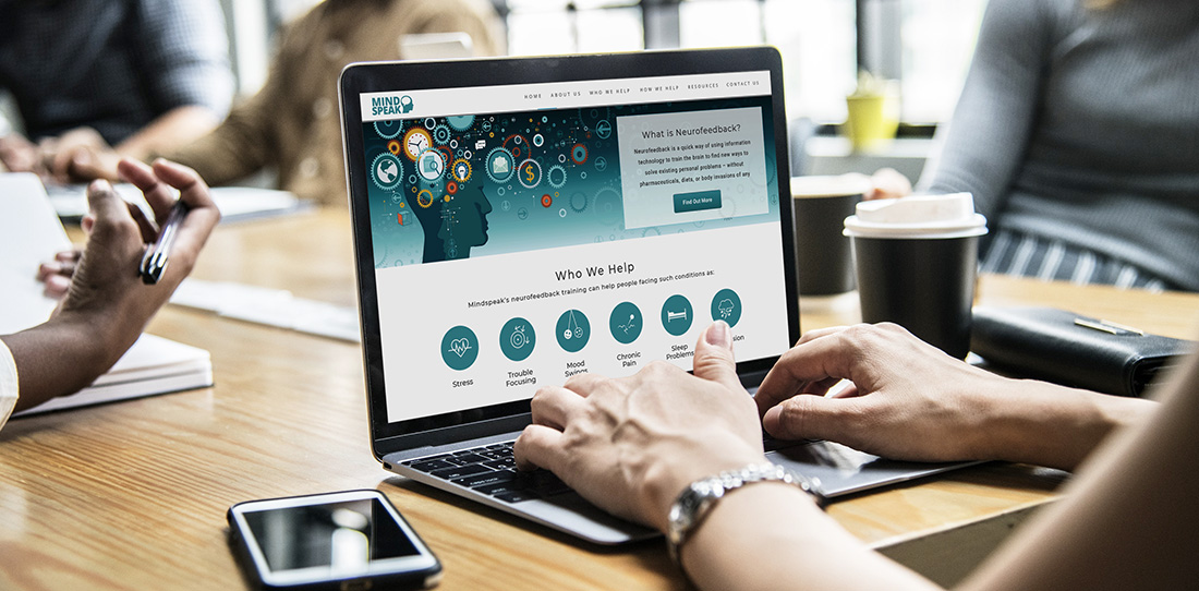
The site was developed and deployed on the WordPress platform.
Social Media Promotion
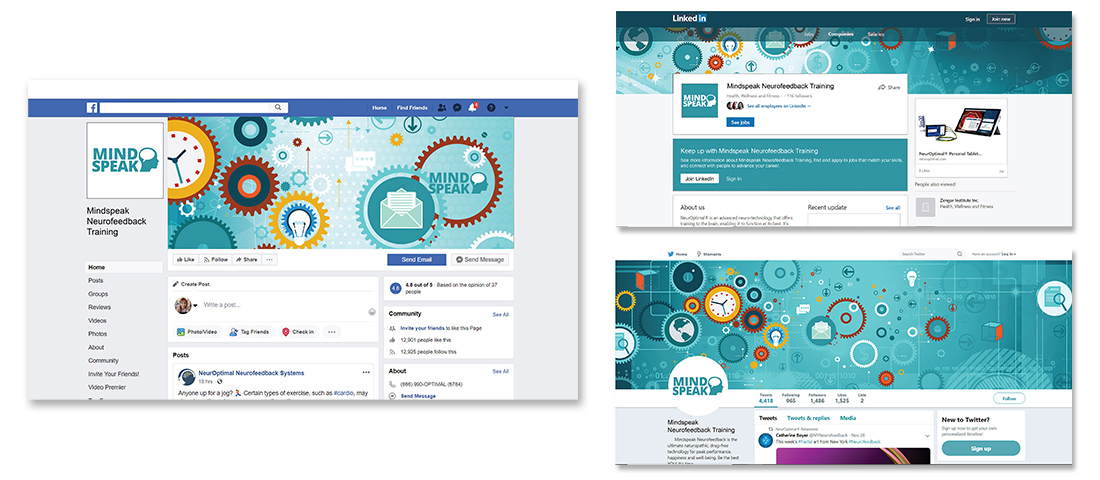
To support the brand our team developed a set of Social Media templates and illustrations that could be used in the future.
